
Meaningful data is critical to APEX customers.
APEX products have been helping our customers transform raw data into actionable information through data processing visualization for 25 years. Large-scale engine tests require high data throughput in both real-time testing environments and post-analysis. Our customers regularly sift through terabytes of high volume, high sample rate data, and rely on APEX products to help interpret those numbers into meaningful results. Since establishing itself as a solutions provider in aeromechanics testing in 2000, APEX has continuously developed software featuring cutting-edge visualization toolkits that frequently enhance the state of the art in data visualization and processing. These toolkits reflect our engineers’ commitment to understanding and implementing complex processes. This article offers an overview of the evolution of visualization within APEX products. Click the arrows below to explore how APEX has pioneered tools for visualizing complex data throughout our company’s history.
2000
It started with GageMap
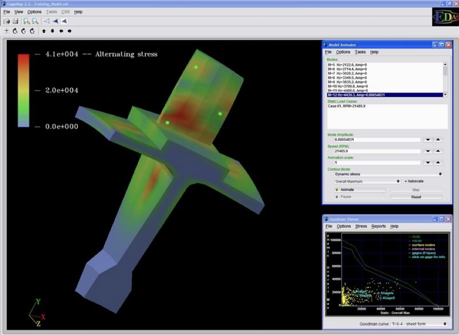
GageMap, APEX’s first commercial product, used Finite Element Model results from FEA software like ANSYS, ABAQUS, and NASTRAN to physically model strain gage and displacement sensor locations using advanced calculations and algorithms. This enabled accurate and consistent instrumentation of parts, definition of limits, and refinement of analysis.
When released in 2000, GageMap included a revolutionary set of visualization tools to animate 3D models based on FEM results. It exported Goodman diagrams for pre-test predictions and provided a limits file outlining HCF safety limits based on sensor location and mode. The ability to utilize these limit results was incorporated into future APEX products for enhanced real-time and post-test analysis.
GageMap was among the first to confidently predict sensor results before testing.
2001
Real-time visualization and Campbell diagrams
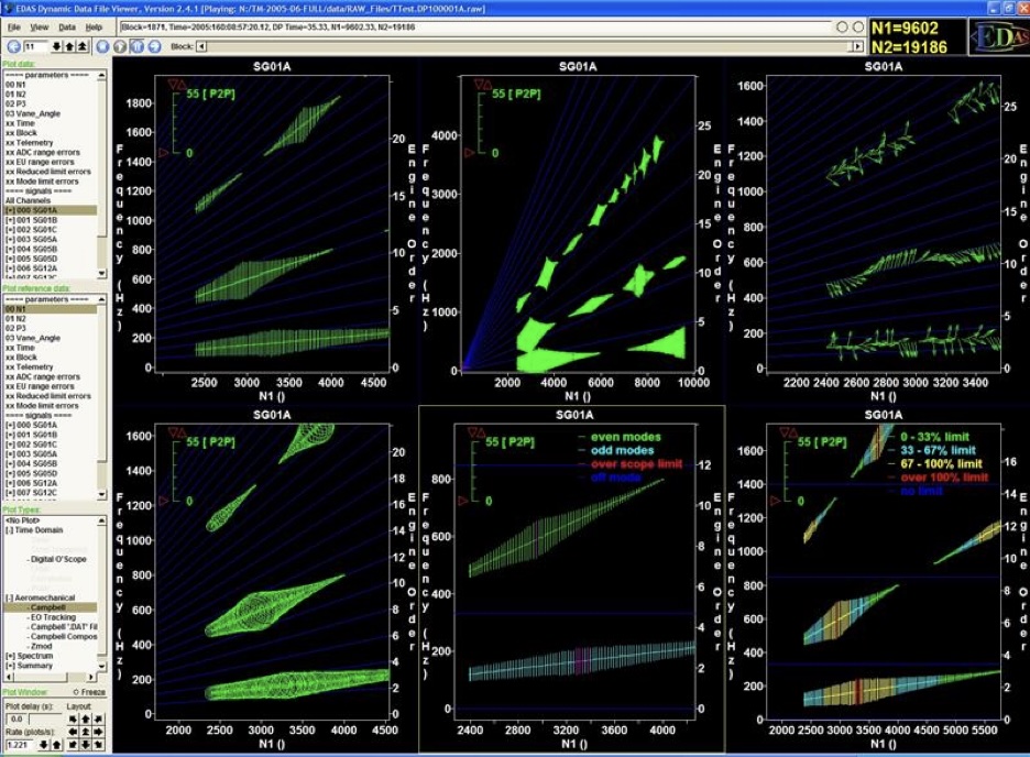
In 2001, the APEX DS product suite was released for high-sample-rate dynamic data acquisition and analysis. The DS suite allowed real-time visualization and analysis through live data stream subscriptions. Users could access data remotely during tests from anywhere in the world. It provided engineering diagrams like time and scope plots, spectral plots, and Campbell diagrams, with remote monitoring capabilities. Users could create many plots and pages showing processed data faster than any previous product. The DS suite was praised for its responsiveness, flexibility, and accuracy.
DS was the first product to integrate Campbell diagrams into real-time testing environments. APEX achieved this using a processing method called “Peaks.” Peaks processing enabled users to visualize Campbell diagrams and FFT data with flexibility, accuracy, and speed. The introduction of real-time Campbell diagrams in 2001 marked a significant development in data visualization for dynamic data. APEX played a role in advancing the testing industry by enhancing the ability to create, view, and analyze complex engineering diagrams in real-time.
2007
The Evolution of Data Visualization and Analysis
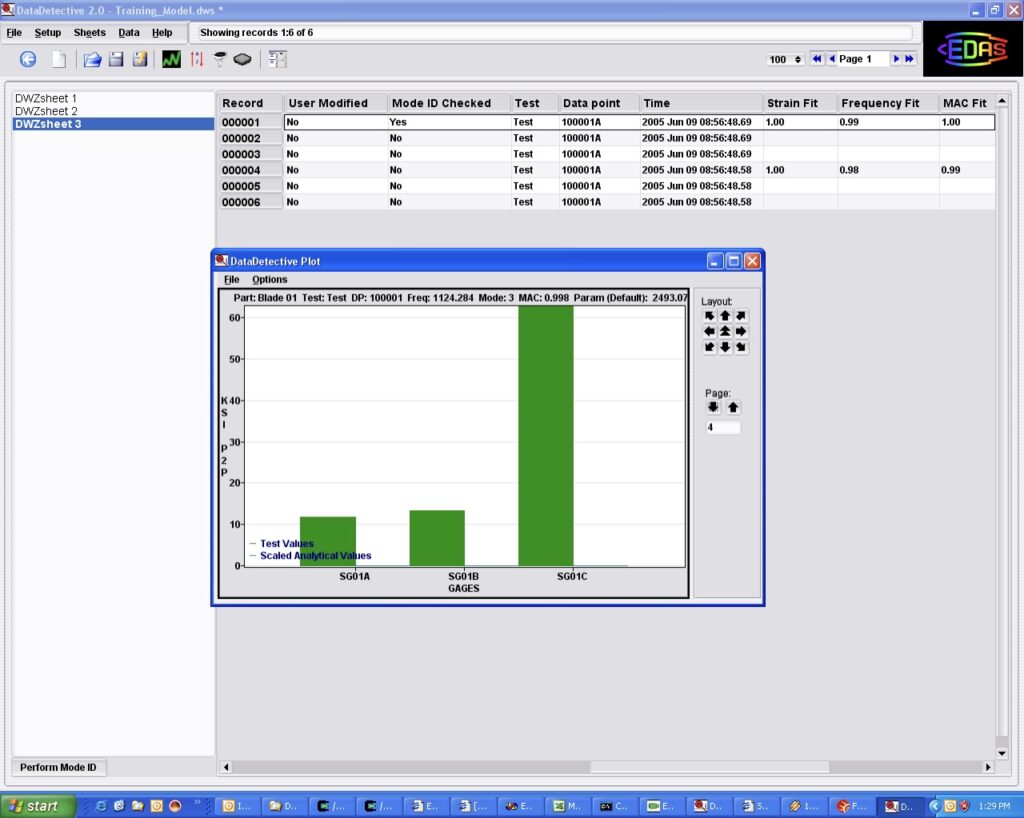
From 2001 to 2015, APEX grew significantly and was able to develop a robust customer base with its flagship products, significantly enhancing data visualization and post-processing capabilities for critical tests. The introduction of EDAS-PB in 2007 enabled users to employ EDAS-DS’s online testing features in post-processing, thereby improving data analysis. Advancements in DS and EDAS-PB incorporated new visualization features such as enhanced plot pages, additional supported plots, support for diverse file formats, and customizable data visualization options. These enhancements were essential for test engineers analyzing complex data sets.
During this period, APEX undertook substantial efforts to gather information from customers regarding their testing procedures and data visualization needs. This feedback was instrumental in refining and improving APEX’s products to better align with the requirements of test engineers. It became evident that customers required a post-processing product capable of delivering advanced analytical features such as collections interrogation, median ranks, along with support for batch processing and custom reporting.
2011
Plotting Experimentation With Workflow
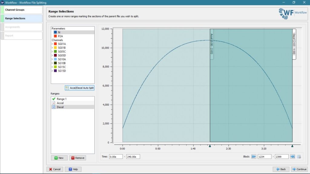
In 2011, APEX released Workflow to offer customers advanced analysis features. While Workflow improved processing capabilities and provided an enhanced set of analysis tools, the fundamental methodology for post-processing needed significant improvement. To address this issue, APEX began developing products based on a process-centric approach instead of the traditional file-based approach used throughout the industry. This fundamental change in data processing sparked significant progress at APEX, continuing to benefit users today.
2015
BT Introduces the APEX Process Designer
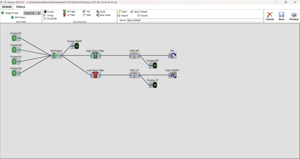
BT was released to provide tip-timing engineers with an enhanced suite of tools for post-test analysis and visualization. It was the first APEX product launched using the fundamentals of process-based analysis through a visual “process designer.”
In previous APEX Products, as well as many other commercially available testing software, processing was directly tied to the plot. This required new processing to be calculated and applied to the data for every plot created to display accurate information. In BT, we developed a method to visualize the data processing design, process the data through this design, and subsequently generate plots from the processed data instantaneously. This approach significantly reduced processing time for the large data sets we frequently handle and provided engineers with a documented, visual record of their data processing methodology.
The introduction of this functionality positively influenced all future APEX products and altered the development trajectory of numerous other solutions within the critical testing industry.
2016
Foundational and flexible plotting in DX
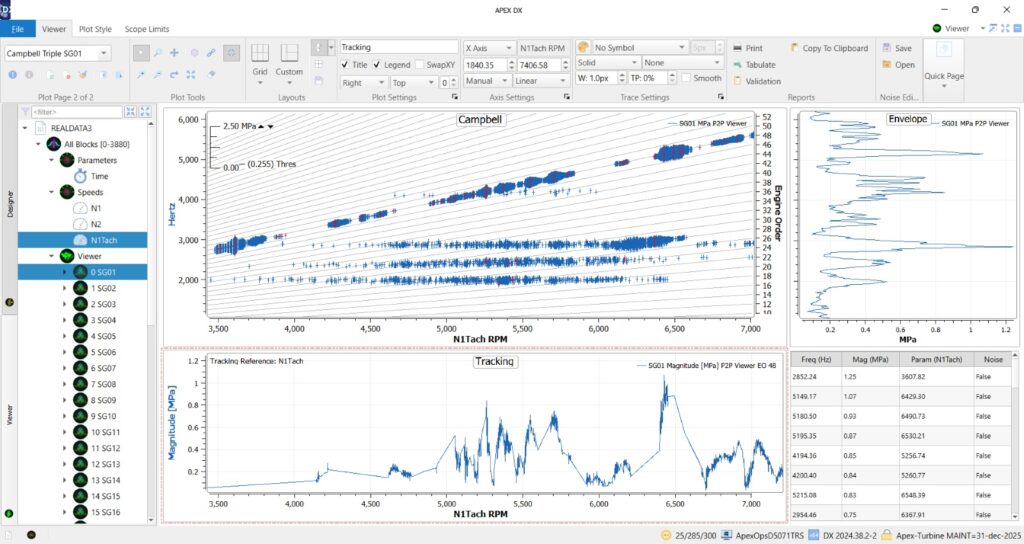
Building on the foundational processing framework established by DS and incorporating the process designer concept from BT, APEX DX was launched and rapidly became the preferred tool in the industry for aeromechanics post-test data analysis. DX introduced an advanced plotting library that enhanced pre-processing data capabilities for instantaneous plot generation, featuring an intuitive drag-and-drop interface and a comprehensive suite of plot tools.
In addition to providing new, clearer, and more functional plots, DX equipped engineers with tools to swiftly create, compare, and reprocess analysis reports. The introduction of “Quick Page” features enabled the simultaneous creation of multiple plots or pages, allowing engineers to efficiently develop and refine report layouts. Moreover, the decoupling of plotting from processing facilitated the repopulation of multiple files onto existing plot frameworks and layouts, paving the way for simplified trending analysis and reporting.
2023
Entering the Next Generation With DX+
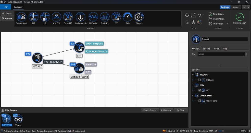
DX+ reintroduces the process designer previously featured in DX and BT, enabling engineers to clearly visualize input sources, processing methods, and outputs. A key enhancement in DX+ is the capability to select or deselect specific data streams and processing on a per-channel basis, ensuring data is stored, shared, and analyzed in the most efficient and targeted manner. Additionally, DX+ now allows users to save and share data streams based on access levels and other criteria, all within a visually appealing and intuitive user interface.
DX+ enhances the layout and plotting library of DX by introducing several significant improvements. One key advancement is that, unlike DX where processing and plotting are interdependent, in DX+ the plotter operates independently from the data processing. This separation allows for faster development on the part of APEX staff when new plots are needed and enables users to input any data into a basic XY plotter to create custom plots beyond the traditional DX toolkit. Additionally, this feature permits the viewer to function as a standalone product, facilitating users to integrate their own data sources (such as Cyres through the DX+ API) into DX+ and utilize the full suite of industry-leading plots.
TODAY
APEX TODAY
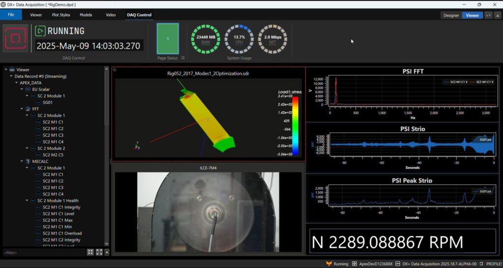
APEX is now targeting a broader testing market with innovative technology for data acquisition and analysis. Leveraging 25 years of experience in product development and support, combined with the adoption of emerging technologies, we have established a new foundation for our future products. With DX+, we have achieved our vision of completely decoupling data acquisition and analysis from analytical visualization. This advancement provides us with the necessary tools to develop truly next-generation visualization features. DX+ can collect, record, analyze, and visualize data from various sources – including devices from our respected hardware partners, video streams, or physical models – enabling unprecedented levels of test comprehension.
APEX’s objective is to enable engineers to understand their data efficiently. The development of DX+ provides new methods for achieving this goal. Using experience from FEM modeling with GageMap, APEX can now take results from CFD or FEM processes and display them in real-time by mapping virtual sensors to the physical component on the engine. Engineers can view the 3D model of their part or engine within DX+ and access sensor results based on various metrics, such as comparative CFD results and modal limits. Additionally, DX+ can incorporate video input for a live view of the actual test.
APEX continues to invest in advancing the art of data visualization through our DX+ product. We are enthusiastic about the direction our new visualization tools are heading, and we hope this article has provided valuable insights into how APEX has developed these tools over the years. Your team is invited to schedule a real-time demonstration of DX+, or any of our APEX products. Please use the form below to request your demo session.